Live Type
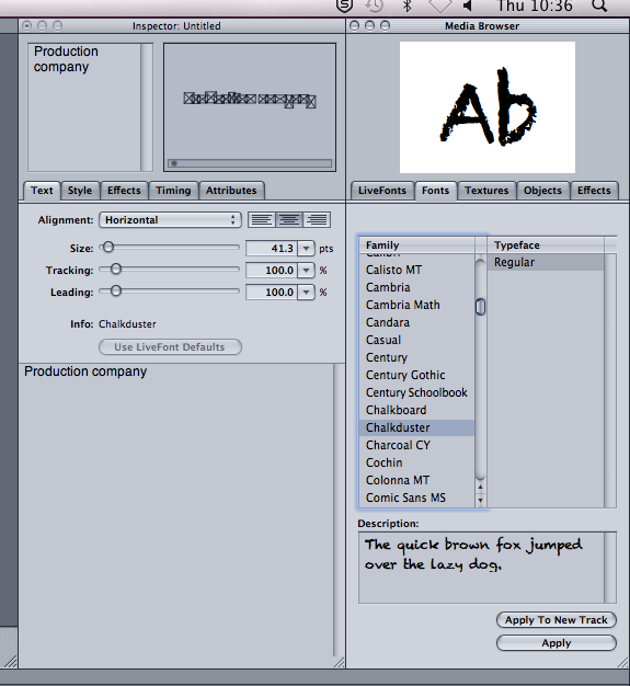
During today's lesson along with finalising our Garage Band music Sonny and I also started to add credits into our opening sequence. We decided that we wanted to stick to our initial idea of a handwritten font in a white colour, but once we looked at the different font's on Live Type we decided that we wanted to go for a more crackled effect as shown on the screen grab below. We decided on this as at the end of our opening sequence we added a crackled transition in, in between James hitting Sarah and the title of the film ' IMPOSTER' and thought the font would mirror the transition nicely along with it playing on the psychological side of the hybrid genre. The font also looks slightly broken which can also mirror the relationship between Sarah and James as toward the end of the opening sequence us as viewers can see that they aren't happy together and are in a broken relationship as James is using domestic violence on her away from the public eye.

We also decided to leave the font colour in white, as it adds slight irony, with the colour white usually connoting pureness and innocence, which at first the character of Sarah is shown to be, a pure, innocent girl in a happy relationship. It's not until later on when the couple argue and James hits her that us as an audience see that their relationship isn't so pure but more dark and secretive. Sarah is also shown to break this innocent role at the beginning of the opening sequence when she is shown to be covered in blood and crying her eyes out making the audience think that something terrible has happened.
Along with the white font connoting the innocence of the characters and their relationship at the beginning there also is that dark secretive side to the relationship and James mostly, so Sonny and I decided that in between the sinister scenes of James hitting Sarah to add in a black background to the credits of the voiceover being shown. We chose this as the colour black connotes darkness, and quite a weary feel, Mirroring the character of James as well as him being shown as a dark, shadowy figure, the colour black suits him quite well just like the colour white suits the character of Sarah more.
Whilst creating our titles Sonny and I put a lot of thought into how they would look and the meanings behind them, we wanted to show both of the characters equally despite them taking on the role of binary opposites as James is seen to be quite evil compared to Sarah who's seen like the innocent characters, but can also be turned around the other way, Sarah being the evil character as she has supposedly murdered James, and by James putting on the innocent person and acting like he really loves Sarah when actually he ends up using domestic violence on her. We thought a lot about the colours and what they meant and how they could represent different aspects of the characters and story itself.
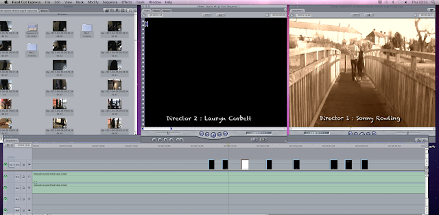
Another problem that we faced was making sure that the credits were continuous sizes. We would create one credit, put it into final cut and then realise that it wasn't the same size as the credit before so had to re-do them on Live Type. The first credit shown is our production company name ' Production 101' which we are thinking of changing. We wanted this credit to stand out from the rest of them so that the audience remember it more, and if us as a company were to produce another opening sequence or film the audience would remember us from this one.
We also had to think about how the colours would look once in the opening sequence, for instance on the sinister flashbacks we put in a black and white effect so they looked rather dark to mirror the violence and the character of James so having white credits appear underneath would be fine as they could be seen and easily read, except we wanted the credits to appear during the happy flashbacks so the main focus of the opening sequence would be on the sinister flashbacks, so the violence of the crime is seen more and the audience remember it. The problem was that we chose a sepia effect for our happy scenes to show the light and innocence of the couple’s relationship, but some of the clips are very light in terms of the sky in certain clips so positioning the credits was important. In the clips with quite bright skies we moved the credits toward the bottom of the clips, or at either side of the characters so the audience can still see the whole of the clip and footage but can also read and see the credits.


