Final Opening Sequence
In today's lesson, we peer assesed another groups work and then had and gave feedback to one another. Sonny and I were told that our opening sequence was very effective and that as a viewer they would want to watch more, but had to change the colour of the blood in one of the beginning clips where Sarah is washing her hands as it didn't look as realistic as the blood shown in other clips effecting the continuity, as well as the voice over needed to be turned down slightly, so that the soundtrack could be heard more during the happy flashbacks.
We took these points into concideration and changed them, then watched our opening sequence one last time before exporting it and uploading it to youtube.
Showing posts with label Production. Show all posts
Showing posts with label Production. Show all posts
Thursday, 18 April 2013

Sunday, 17 February 2013
Analysis, Success Criteria and Review of Opening Sequence.
Analysis
In today's lesson Sonny and I went through and analysied the whole of our opening sequence. We analysied the editing, sound, titles, and the suitablility of the opening sequence as a whole in terms of how weak, satisfactory and strong each micro element was with comments at the end with notes in showing all the things we had included in our opening sequence within each micro element as shown in the table below.
We also talked about what we thought could be improved during the last lesson before the opening sequence was published. We said that we needed to add in a production logo at the beginning to make the sequence look more professional and to make it slightly longer so that we're nearer to the 2 minute mark. We also needed to make the soundtrack slightly loader and turn down the voiceover as it was just a little too quiet and hard to hear.
Success Criteria
Sonny and I also made a success critera on everything we would include for each element and then re-watched our opening sequence to see if we had included everything we said we would.
I made a success criteria on the suitablity of the opening sequence and the sound used and said...
I will be successful if I make our opening sequence suitable towards the target audience, and all of the conventions included i.e editing, sound and titles. I will try not to bore the viewer, by showing them a well planned and thought out opening sequence that's continuous and includes a sufficiant amout of enigma codes to keep them hooked and interested.
I will also be successful if the sound used is synchronous to the clips shown, by also using a range of diegetic and non-diegetic sounds such as the sound track and voice over to use variety, but making sure they are relevant to the story being shown.
Sonny made a success criteria on the editing that we will use and the titles that we will include, shown on the screen grab below.

We also did a video to talk about our analysis and success criteria this lesson, to make it clear what we were going to do to improve our opening sequence before we published it.
In today's lesson Sonny and I went through and analysied the whole of our opening sequence. We analysied the editing, sound, titles, and the suitablility of the opening sequence as a whole in terms of how weak, satisfactory and strong each micro element was with comments at the end with notes in showing all the things we had included in our opening sequence within each micro element as shown in the table below.
Weak
|
Satisfactory
|
Strong
|
Comment
|
|
Suitability as an opening sequence
|
X
|
Enigma codes
Clear story
Hooks
|
||
Titles
|
X
|
X
|
Clear and visable
Variety of font and colour
Use of effect
Last an appropriate amount of time
|
|
Editing
|
X
|
X
|
Slow motion
Montage
Colour manipulation
Titles
Transitions
|
|
Music
|
X
|
Synchronous with clips
Range of diegetic and non-diegetic music.
Clear changes
|
||
Voice Over
|
X
|
Clear
Understandable
Right volume to diegetic music
Synchronous to flashbacks
|
We also talked about what we thought could be improved during the last lesson before the opening sequence was published. We said that we needed to add in a production logo at the beginning to make the sequence look more professional and to make it slightly longer so that we're nearer to the 2 minute mark. We also needed to make the soundtrack slightly loader and turn down the voiceover as it was just a little too quiet and hard to hear.
Success Criteria
Sonny and I also made a success critera on everything we would include for each element and then re-watched our opening sequence to see if we had included everything we said we would.
I made a success criteria on the suitablity of the opening sequence and the sound used and said...
I will be successful if I make our opening sequence suitable towards the target audience, and all of the conventions included i.e editing, sound and titles. I will try not to bore the viewer, by showing them a well planned and thought out opening sequence that's continuous and includes a sufficiant amout of enigma codes to keep them hooked and interested.
I will also be successful if the sound used is synchronous to the clips shown, by also using a range of diegetic and non-diegetic sounds such as the sound track and voice over to use variety, but making sure they are relevant to the story being shown.
Sonny made a success criteria on the editing that we will use and the titles that we will include, shown on the screen grab below.

We also did a video to talk about our analysis and success criteria this lesson, to make it clear what we were going to do to improve our opening sequence before we published it.
Thursday, 7 February 2013
Editing: Opening Sequence, Final Lesson.
Final Lesson
Today was the final lesson to finish our opening sequences, and all Sonny and I mainly needed to do was add in our production company logo to help extend the whole of the opening sequence to one minute 40 so that it was closer to the two minute mark, as well as it making the whole sequence look more professional.
The production company logo on Live type and chose 'Frigid' as the effect for our production name to flash in. We knew that we wanted a text and colour that was quite modern to attract a lot of younger viewers as that's who our production company would make films for, so we went for quite a jumpy, flashy effect along with the colours of red for the main body of the text, shadowed by a light blue to contrast, also shown on a black background so it's visible and clear, along with the positioning of the text central, so viewers can easily read it and hear the effects going on in the background, without too much going on.

Sonny and I also chose to add in another sound effect at the beginning of our opening sequence where the production company logo comes in, and again didn't want anything instrumentally so went for something more modern to mirror the colours and positioning of the text and chose a crackled effect of people talking over a radio. It sounded rather thrilling and different, and linked well to the beginning of our opening sequence music where the drum track started.

Today was the final lesson to finish our opening sequences, and all Sonny and I mainly needed to do was add in our production company logo to help extend the whole of the opening sequence to one minute 40 so that it was closer to the two minute mark, as well as it making the whole sequence look more professional.
The production company logo on Live type and chose 'Frigid' as the effect for our production name to flash in. We knew that we wanted a text and colour that was quite modern to attract a lot of younger viewers as that's who our production company would make films for, so we went for quite a jumpy, flashy effect along with the colours of red for the main body of the text, shadowed by a light blue to contrast, also shown on a black background so it's visible and clear, along with the positioning of the text central, so viewers can easily read it and hear the effects going on in the background, without too much going on.
Sonny and I also chose to add in another sound effect at the beginning of our opening sequence where the production company logo comes in, and again didn't want anything instrumentally so went for something more modern to mirror the colours and positioning of the text and chose a crackled effect of people talking over a radio. It sounded rather thrilling and different, and linked well to the beginning of our opening sequence music where the drum track started.

Editing: Opening Sequence, Lesson 11
Today I spent the day in media trying to finalise our opening sequence as last lessons Sonny and I still needed to add in an extra 30 seconds to be as close to the 2 minute mark as possible, So I went through the footage again to see what I could add in without changing the story line too much.
For the extension of the clips I started with the montage at the beginning of the sequence where Sarah is in the bathroom. I didn't want to jump cut it anymore than it already was otherwise it would be too flashy and the audience wouldn't be able to focus properly on what was happening, so I added the clips into the actual storyline instead of the jump cuts of Sarah crying. It was more relevant to extend the clips where Sarah was washing the sink out and extracting soap from the dispenser instead of re writing the whole opening to the sequence. I also put some of the clips from the sinister scenes where James is walking toward Sarah in the point of view shots, by doing this it added to the psychological hybrid of the genre more as it seemed like she was thinking more about what he did to her rather than suddenly adding it into a darker flashback at the end of the opening sequence, As well as making it continuous throughout, I also added the clips of James walking toward Sarah and him hitting her in between the credits during the happy scenes, to make it more effective and make the audience remember what's actually happening between both of the characters throughout rather than them thinking about what's happening in separate flashbacks.
Through the extension of the clips, this meant that I also had to extend the music on garage band, and re-think what was actually happening in the music and if it synchronised with the clips well. When I went back over the music I realised that there wasn't really any climax, even though they were synchronous and changed where the clips and flashbacks did, So I kept the beginning drum track and the piano but added in more layers, For example I changed the mood of the piano three times throughout the happy scenes, so they were more upbeat but still in a minor key to relate to the sadness and create a more tense atmosphere to the clips.

To climax the music and make it more interesting so that the audience don't get bored, I added in a range of guitar chords and riffs, changing where the clips changed and coming in where Sarah is shown to be laughing in slow motion, helping to create her character to show a more edgy and dark side to her mirroring the music. Then the same guitar riff that we had previous is used during the Sinister flashbacks where the audience finally see James walk up and hit Sarah from the Point of view shot as one continuous clip is used, and when that died down, and the voice over says " IMPOSTER" a non-diegetic sound of a rumble is played, and buzzes out just as 'IMPOSTER' flashes off, again adding to the atmosphere and tension of the opening sequence.

Not only was changing the music in Garage Band essential to be synchronous to the extended clips, the credit in Live Type also needed to be changed, and a few more needed to be added in as the positions of the credits were set to go with the lighting during the happy flashbacks, whereas now they come in in between the flashbacks on a black background, as shown in the screen grab below. This meant that the position of the credits needed to be changed. From research I know that typically people read text in a 'Z' formation following the grid of 3, So that's the way I positioned the credits, to appear in a 'Z' formation so that the audience know where to look when reading, as well as it hooking them and keeping them interested in the opening sequence.

The credits throughout our opening sequence also needed to be made bigger as they were too small for the viewer to read, especially in the original places that they were in at the bottom of the screen. As shown in the screen grab below the titles are now more visible and the white font stands out clearly from the black background. The black background also made more sense rather than just having titles appear during the clip as the colours mirror the characters quite nicely. The white connoting the innocence of Sarah during the beginning of her and James' relationship in contrast to the black of the background connoting the darkness of the character James and the crime that he commits as well as the character of Sarah as she has supposedly killed James in reference to the enigma codes. I also made the credits during the happy flashbacks last longer as they were rather quick for the viewer to see as well. After doing research on the credits by watching some opening sequences in class I could see that most of the higher level opening sequences had titles that lasted roughly 3-5 seconds, so I made the titles last longer than they actually were and now last around 3-4 seconds before transitioning into the next happy flashback clip.

Colour manipulation was also added to the extra footage in the opening sequence to make the blood in the scenes more effective and realistic. Changing the blood was quite hard as it could either look too red or too orange. I found that the best solution was to just change the lighting by turning up the whiteness and brightness of the clips, as well as the saturation and colour slightly as shown below. By making the clip brighter the sink in the scene outlined the shape of Sarah's hands more and made the paint (fake blood) look darker and therefore more realistic. The same technique was applied to all of the bathroom scenes containing blood to keep it continues, making sure there were no continuity errors.

Thursday, 31 January 2013
Editing : Opening Sequence, Lesson 10, Live Type
Live Type
During today's lesson along with finalising our Garage Band music Sonny and I also started to add credits into our opening sequence. We decided that we wanted to stick to our initial idea of a handwritten font in a white colour, but once we looked at the different font's on Live Type we decided that we wanted to go for a more crackled effect as shown on the screen grab below. We decided on this as at the end of our opening sequence we added a crackled transition in, in between James hitting Sarah and the title of the film ' IMPOSTER' and thought the font would mirror the transition nicely along with it playing on the psychological side of the hybrid genre. The font also looks slightly broken which can also mirror the relationship between Sarah and James as toward the end of the opening sequence us as viewers can see that they aren't happy together and are in a broken relationship as James is using domestic violence on her away from the public eye.
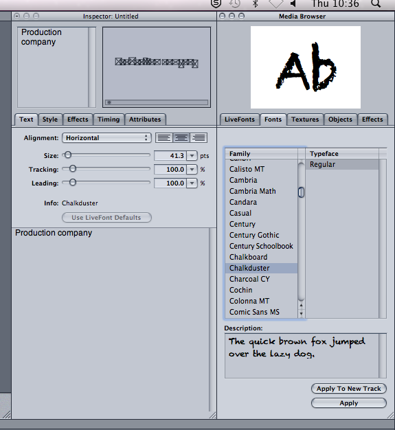
We also decided to leave the font colour in white, as it adds slight irony, with the colour white usually connoting pureness and innocence, which at first the character of Sarah is shown to be, a pure, innocent girl in a happy relationship. It's not until later on when the couple argue and James hits her that us as an audience see that their relationship isn't so pure but more dark and secretive. Sarah is also shown to break this innocent role at the beginning of the opening sequence when she is shown to be covered in blood and crying her eyes out making the audience think that something terrible has happened.
Along with the white font connoting the innocence of the characters and their relationship at the beginning there also is that dark secretive side to the relationship and James mostly, so Sonny and I decided that in between the sinister scenes of James hitting Sarah to add in a black background to the credits of the voiceover being shown. We chose this as the colour black connotes darkness, and quite a weary feel, Mirroring the character of James as well as him being shown as a dark, shadowy figure, the colour black suits him quite well just like the colour white suits the character of Sarah more.
Whilst creating our titles Sonny and I put a lot of thought into how they would look and the meanings behind them, we wanted to show both of the characters equally despite them taking on the role of binary opposites as James is seen to be quite evil compared to Sarah who's seen like the innocent characters, but can also be turned around the other way, Sarah being the evil character as she has supposedly murdered James, and by James putting on the innocent person and acting like he really loves Sarah when actually he ends up using domestic violence on her. We thought a lot about the colours and what they meant and how they could represent different aspects of the characters and story itself.
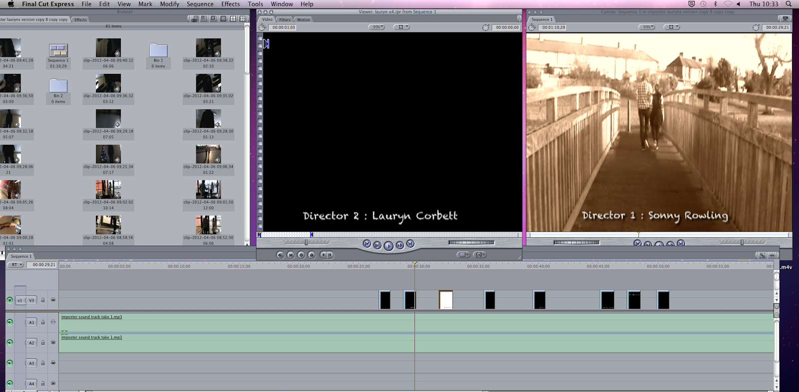
Another problem that we faced was making sure that the credits were continuous sizes. We would create one credit, put it into final cut and then realise that it wasn't the same size as the credit before so had to re-do them on Live Type. The first credit shown is our production company name ' Production 101' which we are thinking of changing. We wanted this credit to stand out from the rest of them so that the audience remember it more, and if us as a company were to produce another opening sequence or film the audience would remember us from this one.
We also had to think about how the colours would look once in the opening sequence, for instance on the sinister flashbacks we put in a black and white effect so they looked rather dark to mirror the violence and the character of James so having white credits appear underneath would be fine as they could be seen and easily read, except we wanted the credits to appear during the happy flashbacks so the main focus of the opening sequence would be on the sinister flashbacks, so the violence of the crime is seen more and the audience remember it. The problem was that we chose a sepia effect for our happy scenes to show the light and innocence of the couple’s relationship, but some of the clips are very light in terms of the sky in certain clips so positioning the credits was important. In the clips with quite bright skies we moved the credits toward the bottom of the clips, or at either side of the characters so the audience can still see the whole of the clip and footage but can also read and see the credits.
Editing : FinalCut, Lesson 10, Garage Band 2
Garage Band
To put our soundtrack onto Final Cut we firstly had to send it to iTunes as shown below. From there I found it in my documents, iTunes, iTunes media, music, my computer, imposter, then I could import it into final cut, put an imput and an output in where i wanted the soundtrack to start and finish, and then drag and drop it into the two audio lines. Once this was done all we had to do was line the clips up with the soundtrack to make sure they were synchronus, which they were and then we were finnished with that step. Now all we had to do was focus on creating the credits on Live Type and the voiceover.

To put our soundtrack onto Final Cut we firstly had to send it to iTunes as shown below. From there I found it in my documents, iTunes, iTunes media, music, my computer, imposter, then I could import it into final cut, put an imput and an output in where i wanted the soundtrack to start and finish, and then drag and drop it into the two audio lines. Once this was done all we had to do was line the clips up with the soundtrack to make sure they were synchronus, which they were and then we were finnished with that step. Now all we had to do was focus on creating the credits on Live Type and the voiceover.

Wednesday, 30 January 2013
Production company logo research
Production Company Logo Research
For our opening sequence along with our production name we also have to come up with a production logo to make it look more professional and like a real film opening sequence. Over the

One of the older production logos that I looked at was 'Metro Goldwyn Mayer' or MGM's, famously known for Leo the lions roar before the film started. The lion has been used since 1957 and is widely known across the world for its appearances in the tom and Jerry cartoons. The logo clearly stands out from the dark black background from the use of the bright yellow and gold colours, linking with the colours of the lion in the middle. By doing this the audience are able to remember the bright colours along with the iconic roar. From this I can see that using bright colours or colours that link to our production name work quite well as they mirror each other as well as possibly a sound or jingle to go with it as not many logos move let alone have sound with them too.

Another quite old production logo that I chose is Warner Brothers, iconically known for their cartoons and high class films. To the left is Warner Brother's main logo but they actually have several, ranging in different colours and backgrounds depending on the film they produced or what the logo is needed for. For example when used in Harry Potter the logo takes on more dark colours, and an iron cage surrounding the writing compared to when shown in cartoons using the logo as shown to the left, to possibly attract more children for their target audience. By doing some research on the Warner Brothers logo i can see that typically one logo isn't needed, and one logo isn't right or wrong, that they can vary to what sort of film or TV show that you produce to try and attract more of that specific target audience which is possibly what Sonny and I need to think about, to directly think about our target audience and how our logo can link with the film and attract them rather than thinking about the logo as a a separate idea.

For my next production logo I chose something a bit different and not as popular as the last two, extra ordinary films. The logo has a lot of word play and has a lot to think about. For example the wording of ' extra ordinary fims' plays on the mind a little bit. For one the word says 'ordinary' yet is written in Italics, making it more abnormal than ordinary compared to 'extra' and 'films' that are both in the same font, if the productions are so ordinary why the font change? The company have also added slight humour to their slogan underneath by saying " a corporation of very awesome people" again, the view doesn't know who produced the film, and can only tell by the logo that is produced what sort of company they are and by their wording they are possibly quite a humours company that produce comedies as the slogan connotes humour unlike a more well-known company like Warner Brother, and possibly makes their company look less professionally. From this logo I can see that humour can be added to a logo without the company name actually being comical but at the same time can look less professional. Sonny and I need to think about whether we want a play on words such as italics or bold fonts as well as if we want to create a slogan for the audience to remember.

Another company logo that I found was 'Pirate Tree Productions' and I found it rather interesting and literal. The logo literally does what it says; you can see a pirate ship inside a tree. The fact that they have made their logo very literally is interesting as, as a viewer it's easy to remember and also quite comical and clever, along with the little anchors inside the O's, it's plain and simple but with thought behind the creation. I can see that even if the font's don't change adding little pictures inside letters can also create a great effect as it mirrors the company's name. Also the logo doesn't have to be all words, that adding a picture inside a picture can be rather interesting and play on the mind leaving the viewer hooked.

For my final logo I chose Disney for the iconic font. For many years since the first Mickey Mouse cartoon this font has been highly known worldwide, despite the picture behind. Many companies have played on this font, changing the style or colour but is always know to originally come from Disney. It also shows that a company can also be named after the creator along with the logo. I can see that even a picture or image isn't necessary in a logo if the font is memorable and well known. The logo creating process doesn't need to be hard, it's fairly simple, it's just choosing something memorable, that our target audience will like linked too, or not linked to the film itself, and that logos that are more to the point are simpler and wider known then highly detailed logos.
For our opening sequence along with our production name we also have to come up with a production logo to make it look more professional and like a real film opening sequence. Over the
next few lessons Sonny and I will draw up some initial ideas for our production logo, create it and add it into our opening sequence. To gather some ideas for our production logo I have looked at a variety of production logo's some from quite popular companies others from old or fairly new production companies to see how they have changed over time and how editing and production companies have developed ideas along the way.

One of the older production logos that I looked at was 'Metro Goldwyn Mayer' or MGM's, famously known for Leo the lions roar before the film started. The lion has been used since 1957 and is widely known across the world for its appearances in the tom and Jerry cartoons. The logo clearly stands out from the dark black background from the use of the bright yellow and gold colours, linking with the colours of the lion in the middle. By doing this the audience are able to remember the bright colours along with the iconic roar. From this I can see that using bright colours or colours that link to our production name work quite well as they mirror each other as well as possibly a sound or jingle to go with it as not many logos move let alone have sound with them too.

Another quite old production logo that I chose is Warner Brothers, iconically known for their cartoons and high class films. To the left is Warner Brother's main logo but they actually have several, ranging in different colours and backgrounds depending on the film they produced or what the logo is needed for. For example when used in Harry Potter the logo takes on more dark colours, and an iron cage surrounding the writing compared to when shown in cartoons using the logo as shown to the left, to possibly attract more children for their target audience. By doing some research on the Warner Brothers logo i can see that typically one logo isn't needed, and one logo isn't right or wrong, that they can vary to what sort of film or TV show that you produce to try and attract more of that specific target audience which is possibly what Sonny and I need to think about, to directly think about our target audience and how our logo can link with the film and attract them rather than thinking about the logo as a a separate idea.

For my next production logo I chose something a bit different and not as popular as the last two, extra ordinary films. The logo has a lot of word play and has a lot to think about. For example the wording of ' extra ordinary fims' plays on the mind a little bit. For one the word says 'ordinary' yet is written in Italics, making it more abnormal than ordinary compared to 'extra' and 'films' that are both in the same font, if the productions are so ordinary why the font change? The company have also added slight humour to their slogan underneath by saying " a corporation of very awesome people" again, the view doesn't know who produced the film, and can only tell by the logo that is produced what sort of company they are and by their wording they are possibly quite a humours company that produce comedies as the slogan connotes humour unlike a more well-known company like Warner Brother, and possibly makes their company look less professionally. From this logo I can see that humour can be added to a logo without the company name actually being comical but at the same time can look less professional. Sonny and I need to think about whether we want a play on words such as italics or bold fonts as well as if we want to create a slogan for the audience to remember.

Another company logo that I found was 'Pirate Tree Productions' and I found it rather interesting and literal. The logo literally does what it says; you can see a pirate ship inside a tree. The fact that they have made their logo very literally is interesting as, as a viewer it's easy to remember and also quite comical and clever, along with the little anchors inside the O's, it's plain and simple but with thought behind the creation. I can see that even if the font's don't change adding little pictures inside letters can also create a great effect as it mirrors the company's name. Also the logo doesn't have to be all words, that adding a picture inside a picture can be rather interesting and play on the mind leaving the viewer hooked.

For my final logo I chose Disney for the iconic font. For many years since the first Mickey Mouse cartoon this font has been highly known worldwide, despite the picture behind. Many companies have played on this font, changing the style or colour but is always know to originally come from Disney. It also shows that a company can also be named after the creator along with the logo. I can see that even a picture or image isn't necessary in a logo if the font is memorable and well known. The logo creating process doesn't need to be hard, it's fairly simple, it's just choosing something memorable, that our target audience will like linked too, or not linked to the film itself, and that logos that are more to the point are simpler and wider known then highly detailed logos.
Tuesday, 29 January 2013
Editing, Final Cut, Lesson 10, peer evaluation
Peer Evaluation
In today's lesson, Sonny and I watched Conor and Enniola's opening sequence, and they watched ours to see where we had got in terms of editing, and look at the similarities and differences of each other’s work to see what we could have included or what ideas are the same.
Some of the similarities that we both had was the structure. Both groups had decided to show Sarah in the bath room, followed by happy flashbacks and then the sinister flashbacks, the difference was that Conor and Enniola had used a lot more jump cutting throughout, there were lots of flashes between happy and sad flashbacks as well as Sarah crying, it was rather hard to get a grasp on what was going on. Their jump cutting can also be seen as a good thing though as it adds to the psychological side of the hybrid genre, Compared to mine and Sonny's type of jump cutting. We included jump cuts but mainly on the clips of Sarah crying in the bathroom, to play on the psychological side and create the enigma code of why is she crying? Toward the audience. From another prospective ours can be seen as a disadvantage maybe not playing on the psychological side of things enough, as well as loosing on out on viewing time as ours is one minute and ten seconds, whereas Conor and Enniola's is one minute fourty seconds, due to the fact that they included a lot more jump cutting.
Another similarity that both of our opening sequences had was the credits in terms of where they were placed. Conor and Enniola had also include the last line of the voice over jump cutted in between the sinister flashbacks at the end, but instead of having white handwritten font as originally intended they had used quite a flashy, blue, electrical colour, compared to ours where we had used a white colour but a more crackled font to mirror the crackled transition at the end of the opening sequence before 'AN IMPOSTER' appears. At the end 'AN IMPOSTER' also appears in red connoting death and violence which is shown throughout our opening sequence as well as it mirrors the blood and violence at the beginning so the idea was consistent, compared to Conor and Enniola's as they had 'Imposter' flash in a blue colour, where compared to red blue connotes a more calm feeling, considering there’s a flowing idea of domestic violence and possibly knife crime.
Both of our opening sequences also included a lot of differences such as the colours and effects used throughout such as the blood effects at the beginning. Sonny and I brightened the clips containing blood, so the red stood out more, and we slightly dimmed the red so it was darker and created a slight shadow around the drops making it look more like blood, compared to Conor and Enniola's interpretation of blood, as they darkened the clip so the blood looked really dark, which also looked very effective. Our happy and sinister flashbacks also varied in colour effects, Conor and Enniola hadn't added any effects during their flashbacks, they kept it in original colour throughout, which was very consistent, compared to Sonny and I, As we added in a sepia effect to the happy flashbacks, to show that they were flashbacks, but in a lighter happier colour, compared to our sinister flashbacks that are in a black and white effect, again to show that it's a flashback but also to connote the darkness of the domestic violence and mirror the character of James as he's shown as a dark shadowy figure.
I think that it was good to watch Conor and Enniola's opening sequence and compare them as I could see that we had both followed our origional ideas to an extent but had put our own interpretations in them. I can see that it was easier to split the group into pairs as our own ideas have been expressed better in the work that has been produced, as what I or Sonny may have wanted, Conor and Enniola may have not, but on the other side we have a lot of similarities and our opening sequence as a whole would have been fairly similar.
Editing : FinalCut, Lesson 10, Garage Band
Garage Band

For the happy flashbacks, we chose a more upbeat piano option, the music is loader and slightly faster to be synchronous to the clips helping create a happy feel toward the couple, as well as being able to see that they are happy.
During the slow motion clip of where Sarah and James are walking along and Sarah turns around to argue to James, this is where we changed the music to follow on the sinister scenes. We added in some slow electric guitars and a slowed the bass on the drums down, this helped create a dark atmosphere mirroring the idea of James being a dark shadow as well as him committing quite a dark crime of domestic violence.
Below is a screen grab of our final piece of music for our opening sequence the top two lines are the drums and piano for the beginning and the happy flashbacks and then below the bottom three lines consisting of 2 guitars and a violin are where the sinister flashbacks start. We chose drums and a grand piano for the beginning and the happy flashbacks as they are quite upbeat instruments that play happy sounds to the ear, and whilst watching the happy flashbacks the audience are able to get a happy feel toward the couple, as if they are in a happy relationship with each other. Then we chose two different styles of electric guitars, playing quite low notes, helping to create a dark feel along with the violin playing minor cords typically used in horror or thriller movies at tense times to create a dark and erey feel. We thought this would apply to our opening sequence, which it did as it mirrors the dark shadow of James and crime that he is committing.

In today's lesson Sonny and I finalised our piece of music
on Garage Band for our opening sequence and put it into Final Cut to fit with
our clips. We thought that the music was synchronous to the clips as the music
changes exactly when the happy and sinister flashbacks start and finish. I was
also unsure whether to include a bang of some sort at the end of the sinister
flashbacks during the point of view shot where James hits Sarah and falls to
the floor, in the end Sonny and I decided that it would be better to just leave
the sinister music as it is, the chord of music finishes as 'IMPOSTER' crackles
onto the screen.
Below is a screen grab of all the different effects that are
possible on Garage Band, From drums to strings, and once you click that option as
shown below you have a variety of different styles for that instrument. The
ones highlighted in blue, ' Rock/Blues, Kits, and Single' are the effects that
we chose to add into our opening sequence music. For the opening sequence
itself we have a plain piano playing, quite softly and quite as not much is
happening in these clips, i.e. where Sarah is crying into the mirror and
washing out the sink. 
For the happy flashbacks, we chose a more upbeat piano option, the music is loader and slightly faster to be synchronous to the clips helping create a happy feel toward the couple, as well as being able to see that they are happy.
During the slow motion clip of where Sarah and James are walking along and Sarah turns around to argue to James, this is where we changed the music to follow on the sinister scenes. We added in some slow electric guitars and a slowed the bass on the drums down, this helped create a dark atmosphere mirroring the idea of James being a dark shadow as well as him committing quite a dark crime of domestic violence.
Below is a screen grab of our final piece of music for our opening sequence the top two lines are the drums and piano for the beginning and the happy flashbacks and then below the bottom three lines consisting of 2 guitars and a violin are where the sinister flashbacks start. We chose drums and a grand piano for the beginning and the happy flashbacks as they are quite upbeat instruments that play happy sounds to the ear, and whilst watching the happy flashbacks the audience are able to get a happy feel toward the couple, as if they are in a happy relationship with each other. Then we chose two different styles of electric guitars, playing quite low notes, helping to create a dark feel along with the violin playing minor cords typically used in horror or thriller movies at tense times to create a dark and erey feel. We thought this would apply to our opening sequence, which it did as it mirrors the dark shadow of James and crime that he is committing.

Thursday, 24 January 2013
Editing: Final Cut, Lesson 9
In today's lesson I came back and looked over what sonny had done during lessons 6, 7 and 8. He had extended the beginning of the opening sequence by adding in a montage of dripped paint to represent blood, followed by a close up of Sarah about to wash her hands along with a close up of Sarah laughing in the cafe. I thought that the montage was very effective instead of having blood washing down the sink as we now have a wider variety of shots, and the story line is more apparent as well as the close up of Sarah laughing, as the audience are able to see Sarah's expressions during the happy flashbacks, and see that at this point she genuinely is happy with the relationship between her and James. Plus this added an extension on the time limit, as we are now closer to the 2 minute mark.
The opening sequence is pretty much mapped out now, last lesson sonny also created the piece of music on garage band to synchronise with the clips, I also thought that this was very good, the whole piece of music fit well with the clips, and changed when the clips and flashbacks changed. There is a smooth piece of piano music for the happy scenes to connote the calmness in the happy flashback between the couple’s relationship, followed by the electric guitar and bass during the dark scenes to connote the darkness of the domestic violence that James commits and the crime that Sarah commits, that's unknown to the audience but can see her washing blood off of her hands, following the original enigma codes.
All that needs to be done now is the title sequences in the clips, such as the production name and character names, this will be done through live text and will be copied into final cut, the same for garage band, the music just needs to be put onto the audio line, along with the voice over, if we still use one.
Thursday, 17 January 2013
Editing: Final Cut, Lesson 5
Finalising opening sequence
In today's lesson Sonny and I realised that we was nowhere near the 2 minute mark so sat down and planned what we was going to add in to make our opening sequence longer. We found this rather difficult because when we went over our footage we realised that what we had filmed was to go with our original idea, so when the storyline changed we had limited footage to choose from.
Our initial idea was to have Sarah in a dark room, jump cut with text and transitions before the flashbacks started. When we realised this scene was hard to film we changed the beginning so that Sarah was rinsing blood off of her hands in a bathroom, followed by a close up of her crying, which led to the happy and sinister flashbacks. We kept this as the beginning to our opening sequence and worked the flashbacks around it. Now that most of the footage has been planned out we can see that we needed a lot more footage for the flashbacks as we have used most of it already. A lot of the happy flashbacks were just Sarah and James walking away together holding hands or mooching around, I can see now that we need to film a wider range of shots and angles to jump cut too in the flashbacks. Sonny and I are now going to have to go over the footage that we haven't used and see if we can change the story line a little so that we can extend our opening sequence to longer than 1 minute 5 seconds.
After realising that we needed to go through the footage and try to find some more clips to put into the opening sequence between the happy and sinister flashbacks we added a clip of Sarah and James walking, and Sarah turns around and has a go at James, acting as a turning point to their relationship, where it looks like Sarah is causing arguments, until the sinister flashbacks start and we see that actually James is the one that's hurting Sarah and using domestic violence.
At the moment I think that a lot needs to be changed in order to make our opening sequence look smooth just like an actual film opening sequence would. The transitions need to be altered so that they flow into the clips a bit more smoothly and aren't jumpy and quick, A new storyline or plot needs to be thought of to extend our opening sequence to 2 minutes otherwise it won't meet the targets required.
Once the opening sequence has been planned out properly, hopefully next lesson Sonny and I will be able to start creating our music to go with the opening sequence on garage band, along with recording the voice over, as well as drawing a new story board to go with the new clips added to the opening sequence.
Tuesday, 15 January 2013
Editing : Final Cut, Lesson 4
Adding in the dark flashbacks and Including Text
One of the things I did in today's lesson was map out the sinister flashbacks. Me and sonny decided to use the point of view shot of Sarah on the floor as she looks up towards James walking towards her, but cut it after every second or so and place text in between them. On the text we decided to use the very last line of our voice over “A mimic, A wannabe, A fake, A poser, AN IMPOSTER" as it links with the clips and creates effect, so the audience can hear and read the sinister flashbacks. As each clip is shown between the texts James gets closer and closer towards Sarah on the floor and after the words "A poser" appear the audience see James hit Sarah and she falls to the floor, then the title ' IMPOSTER' shows.
To help create more of an effect, the text between the clips of James walking toward Sarah are written in white. This can connote the innocence of Sarah in the sinister flashbacks especially as we can't see her, accept her hands, and then James hit's her making the audience think "why has he hit her" and realise that he is actually an imposter and not what he seems like in a relationship, Juxtaposing to the beginning of the opening sequence where Sarah is shown to be washing blood off of her hands and cleaning out the sink, which then links to the title shown right at the end of the clip. The title is the only piece of text shown in red. We chose to only show this text in red as it mirrors the beginning of the clip where Sarah is washing blood off of her hands, as well as connoting the violence throughout the sinister flashbacks, and the whole idea of domestic violence and the crimes themselves.

We also put the sinister scenes in a black and white effect, with no saturation, by doing this we were able to create a very good dark shadowy figure of James, following our initial enigma code of, 'What does James actually look like?' and 'Why can't we see his face?'. The black and white effect can also connote the darkness in the scenes and the topic of domestic violence itself as it's a very dark and secluded crime again linked to the text in between the flashback clips as they are also in black and white.
As well as finalising both of the happy and sinister flashbacks and putting all of the opening sequence together Sonny and I then started to add in transitions. The main transition was in between the end of the first scene where we see Sarah crying into the mirror and the beginning of the first happy flashback. We decided that we didn't want anything too fancy such as a fade or cross over into a shape and agreed that a blur or fade was more efficient, and in the end we decided to choose a black fade, as the colour black linked into the rest of the colour scheme and the dark, twisted idea of the opening sequence as a whole.
Another transition was also added in at the end of the sinister flashbacks, this time a scratchier, crackly effect. We wasn't quite sure whether this would work, and that just having the title "AN IMPOSTER" flash up quickly like the rest of the text clips would be more effective and consistent, so once miss comes back we will ask for her opinion and see whether she thinks it's effective or not before making a final decision.
Monday, 14 January 2013
Editing: Final cut, Lesson 3, Colour Effects
Colour Effects
In today's lesson Sonny and I went over the happy flashbacks again and looked at the lengths of the clips, and the arrangment of them but mainly looked at the colour saturations. For our happy scenes we wanted the sepia effect, but where some clips have more natural lighting than others sometimes they appeared more orange such as the clip where Sarah puts her hand ontop of James'. We decided to go back over the clips and make sure that they all had roughly the same lighting and sepia effect as other wise there would be a major continuity error.

We also looked at the very beginning of our opening sequence where the blood is draining down the sink. Where we used red paint, it come out slightly pink, so we tried to tone down the colours by adding a more orange effect, as well as making the clip quite bright so the fake blood would stand out in contrast to the white sink. Again making sure that the colours were consistant throughout that scene, as well as the blood shown in the jump cut clip of Sarah washing the sink out.

Saturday, 12 January 2013
Editing : Final Cut Lesson 2
Editing : Final Cut Lesson 2
In today's intervention I attempted to slow down the beginning two clips due to the fact they were sped up last lesson, I still haven't managed to do so but once the opening sequence has been fully mapped out then I will go back and add the slow and fast motion before I add in the voice over.
I mainly started the happy flashbacks in the in the intervention, and managed to figure out how to do the jump cut sequence, by adding in another video line. By doing this it will add a more psychological effect as there will be flashes of her crying in between happy moments, this will create an enigma cade and make the audience think, why is she crying if she's thinking about happy things ? Until the sinister scenes come on and then the audience will start to realise what's going on, by piecing the opening sequence together.

For the happy flashbacks we decided that we wanted a sepia effect, so I turned down the black and grey colours in the clip and turned up the white colours as well as the contrast, this also helped to create a silhouette around both of the characters especially in the scene where they walk outside as a couple into the sun. This will also be done throughout the sinister flashbacks but instead of a sepia effect it will be made black and white to connote the darkness of the character James and the crime itself.
Next lesson I will attempt to get the happy flashbacks more or less perfect
to how I want them along with a transition between the opening and the happy
flashback, And also try to start the sinister flashbacks so then I’m almost
done.
In today's intervention I attempted to slow down the beginning two clips due to the fact they were sped up last lesson, I still haven't managed to do so but once the opening sequence has been fully mapped out then I will go back and add the slow and fast motion before I add in the voice over.
I mainly started the happy flashbacks in the in the intervention, and managed to figure out how to do the jump cut sequence, by adding in another video line. By doing this it will add a more psychological effect as there will be flashes of her crying in between happy moments, this will create an enigma cade and make the audience think, why is she crying if she's thinking about happy things ? Until the sinister scenes come on and then the audience will start to realise what's going on, by piecing the opening sequence together.

For the happy flashbacks we decided that we wanted a sepia effect, so I turned down the black and grey colours in the clip and turned up the white colours as well as the contrast, this also helped to create a silhouette around both of the characters especially in the scene where they walk outside as a couple into the sun. This will also be done throughout the sinister flashbacks but instead of a sepia effect it will be made black and white to connote the darkness of the character James and the crime itself.
Next lesson I will attempt to get the happy flashbacks more or less perfect
to how I want them along with a transition between the opening and the happy
flashback, And also try to start the sinister flashbacks so then I’m almost
done.Thursday, 10 January 2013
Editing : Final Cut, First Lesson
First Lesson
In today's lesson we started to edit our opening sequence together. When we got in Miss Butler told us that our groups would be divided into two and that each of our pairs would both create an opening sequence using the footage that we had all recorded. To some extent this was a good advantage as each person in the pairs would have a fair chance to edit and idea's that wanted to be expressed would come across more clearer. This way it was easier to talk about exactly what we wanted whilst editing the opening sequence and making decisions as to what footage, transitions and effects we wanted would a lot be easier to decide as a pair.
For most of us it was the first time that we had used the 'Final Cut' software on the Mac's, At first it was quite tricky to get used to but once Miss had shown us all the basic's most things were easy to work out. Me and my partner Sonny did come across a problem, we had managed to speed up the clips that we had already cut and dragged in the video line. We tried a lot of different ways to try and fix what we had done but in the end decided to log out and try again. This did take some time and eventually decided to carry on with editing and try not to make the same mistake again with all the other clips, and once we have our opening sequence mapped out we will go back over it and add in transitions and slow and fast motion and try to change the mistakes we made.

From the first day editing I can tell how important the whole process is, whilst going back over the footage I could now see little mistakes that we had made, such as leaving a paint bottle in the background, or being able to see a thumb or shoe within the shot taken. Continuity is also very important as in some shots that we re-filmed you can see a different bracelet that Enniola is wearing or her mascara hasn't run in the same position that we used in the clip as shown above in the screen grab. I also realised that the length and amount of the clips are also very important, considering we cut a lot of the clips down, more variety is needed within them, such as a close up of the character Sarah's face, her looking into the mirror crying should have been filmed a little longer at the end so confusion isn't made when the flashbacks start, along with the quality of the camera. Many shots were rather shaky, so it was harder to cut clips and use them when they move quite a bit. Altogether we had around 22 minutes and 57 seconds of filming completed, hopefully this will be enough to finish the 2 minute opening sequence, even though there is a lot to choose from by the time clips are cut short and transitions are put in place there should be enough.
So far we have only edited up to the flashbacks, we would have got a little bit more done if it wasn't for the speed change half way through, as well as getting to grips with the software. In the next few lessons I hoped to have achieved at least a simple plan of the opening sequence mapped out in the video line and to have started to edit in transitions and effects so that all that is left to do is the voice over and music along with any final changes to be made before completing and added text such as the title and production company name.
Subscribe to:
Posts (Atom)